


MN — Branding for a motorcycle helmet company
MN——摩托车头盔公司的品牌推广
ABOUT PROJECT
The picture is taken from the Internet and the copyright belongs to the original copyright owner。
1 — THE PROJECT
MN is a new Italian motorcycle helmet brand that blends technical performance with a minimal, modern aesthetic.
Our work covered the entire visual ecosystem:
Logo and typographic system• Modular identity elements
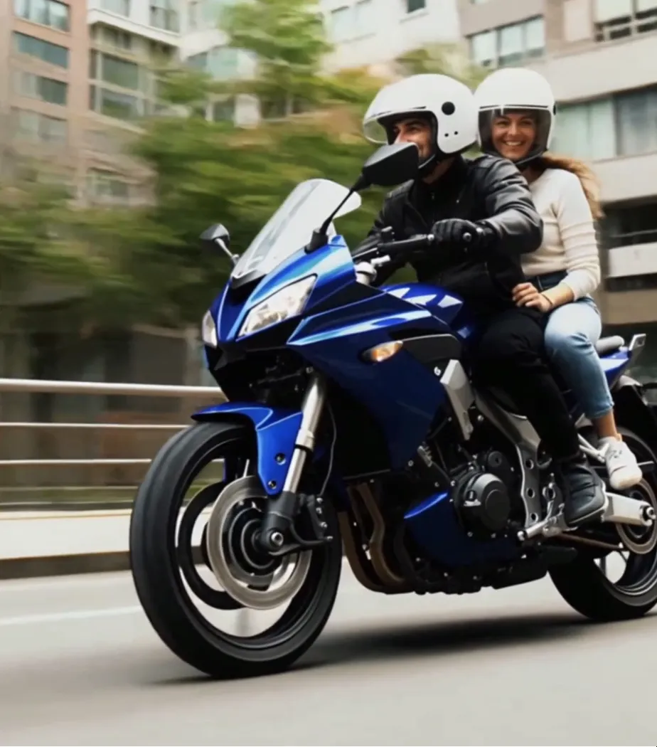
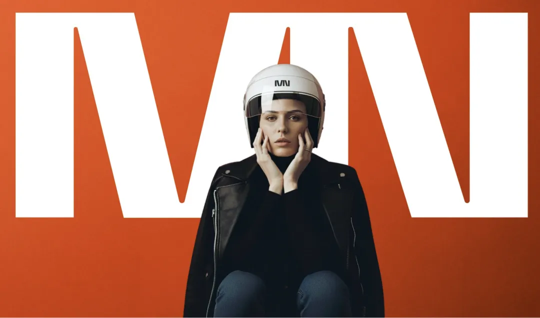
Photographic art direction
Full packaging design
The challenge was to create a visual language able to live on complex 3D surfaces while remaining iconic, bold, and unmistakable across every touchpoint.
2 – CONCEPT
A brand built on speed, not noise.
MN’s identity is rooted in geometric precision, high contrast, and a stripped-back visual rhythm.
In a market often overwhelmed by graphic overload, we pursued a direction that is technical, essential, and distinctly contemporary, the kind of clarity that stands out through silence rather than excess.
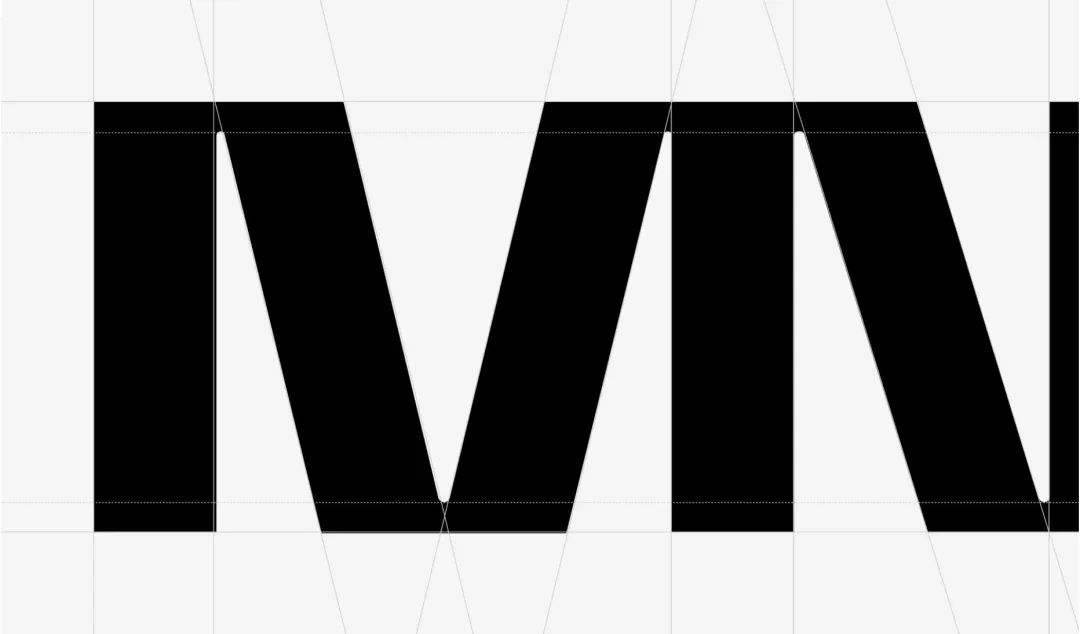
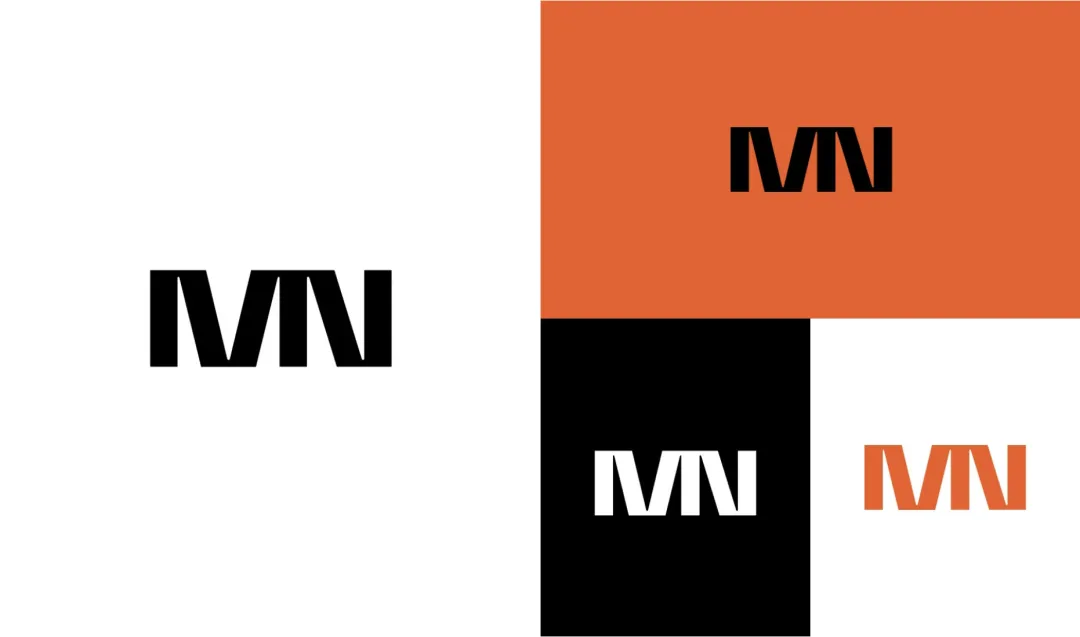
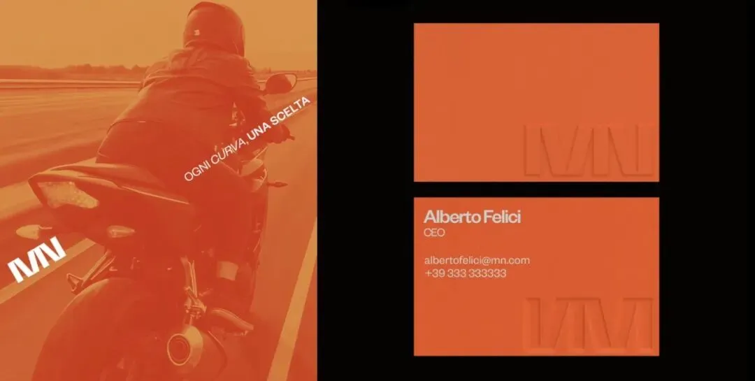
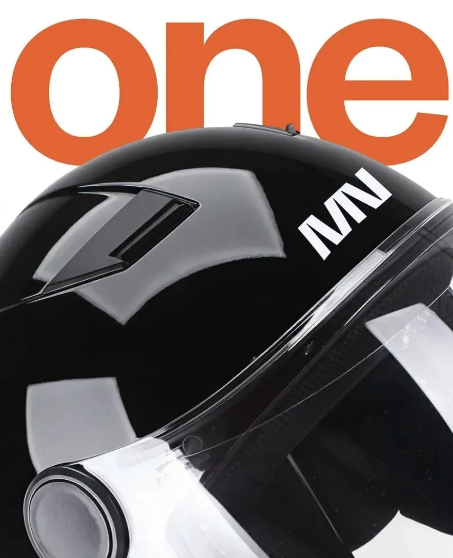
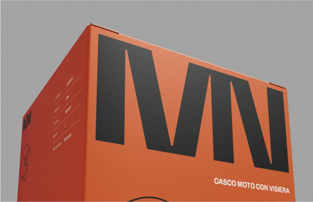
3. BRANDMARK & CONSTRUCTION
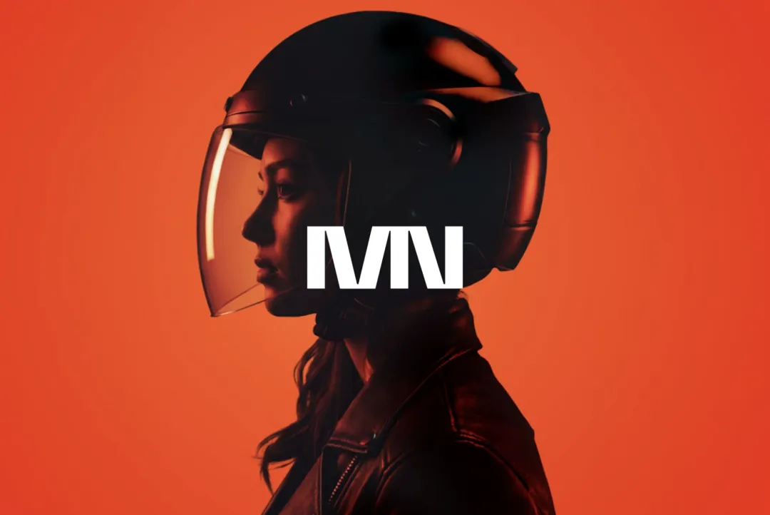
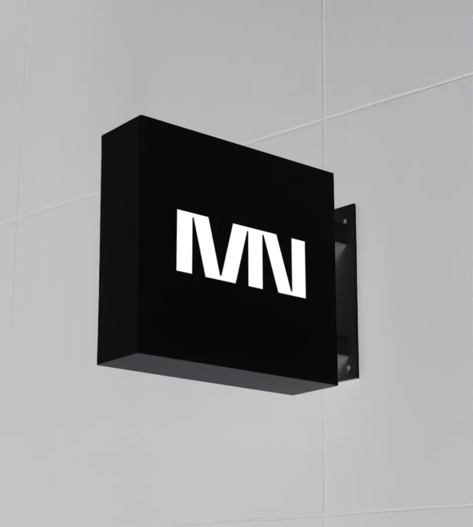
The MN monogram is built on a sharp, directional geometry.
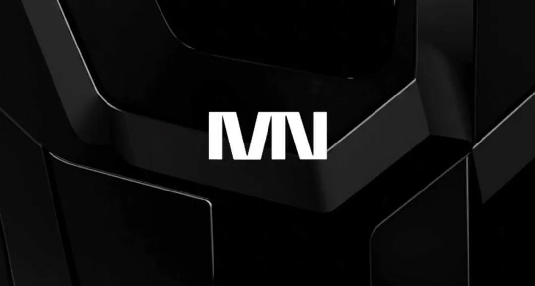
We designed the two letters to also function as a bold, standalone symbol—immediately recognizable and visually impactful. Designed for high readability on curved surfaces, the logo becomes a structural element that anchors the entire visual system.
4. VISUAL IDENTITY SYSTEM
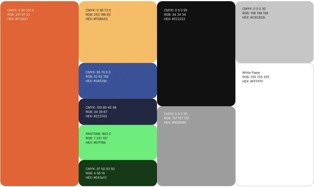
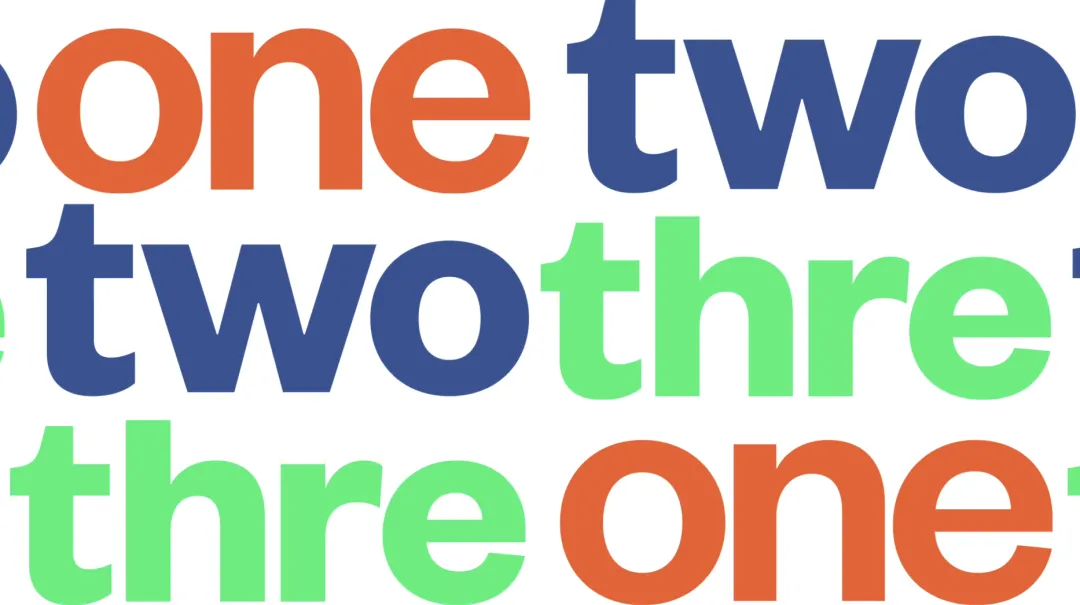
The color palette was designed to work seamlessly across both the visual identity and the packaging system.
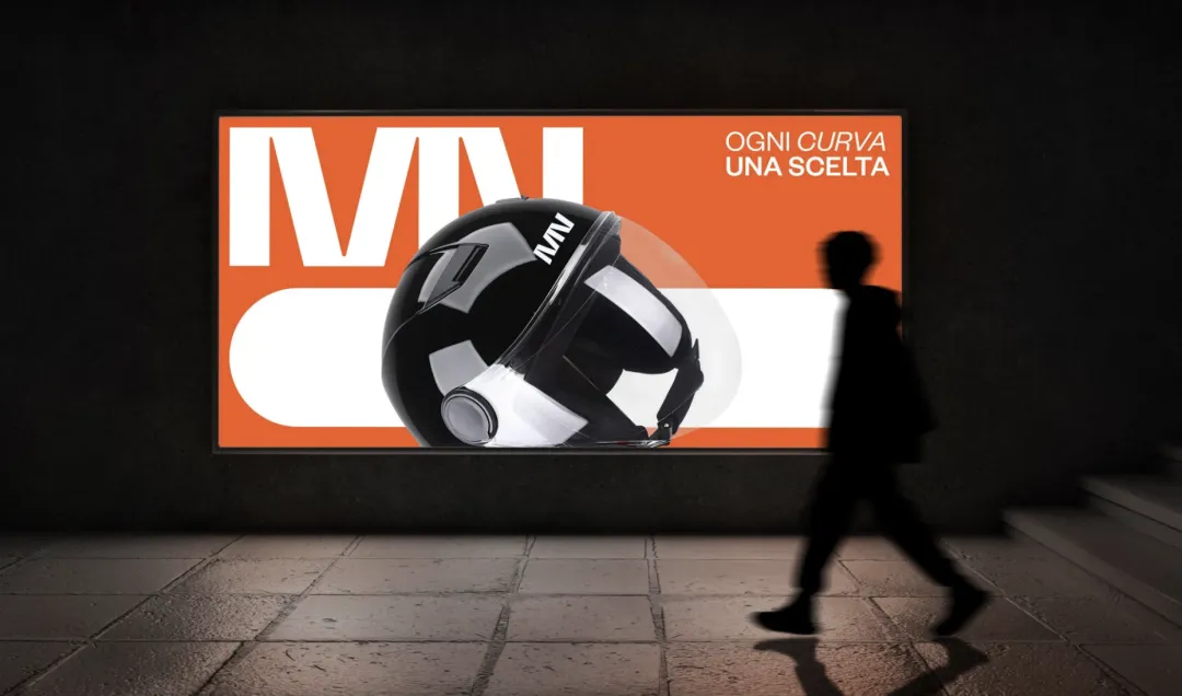
The warm red/orange tone serves as the primary brand color, paired with a yellow accent used to enhance select images for digital advertising and social content.
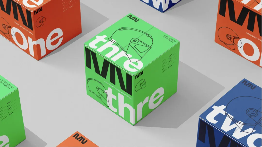
This orange is also the defining color of MN’s first helmet model, ONE.
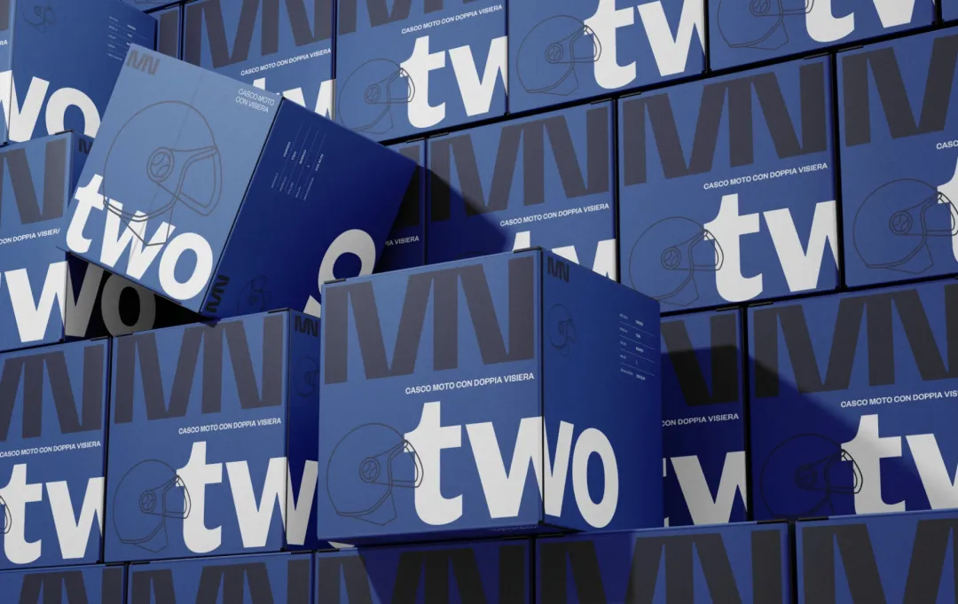
For the packaging of models TWO and THREE, we introduced an acid green and a blue, each supported by darker tonal variations used for structural and secondary elements within the packaging system.
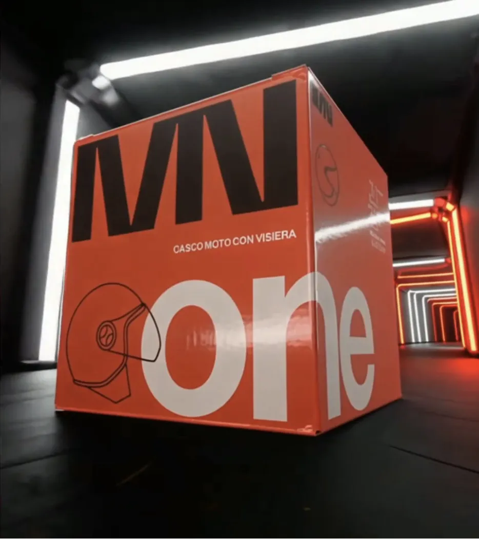
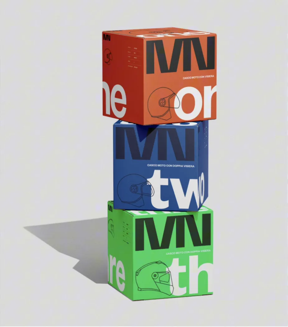
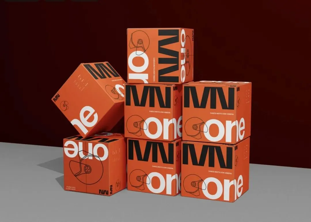
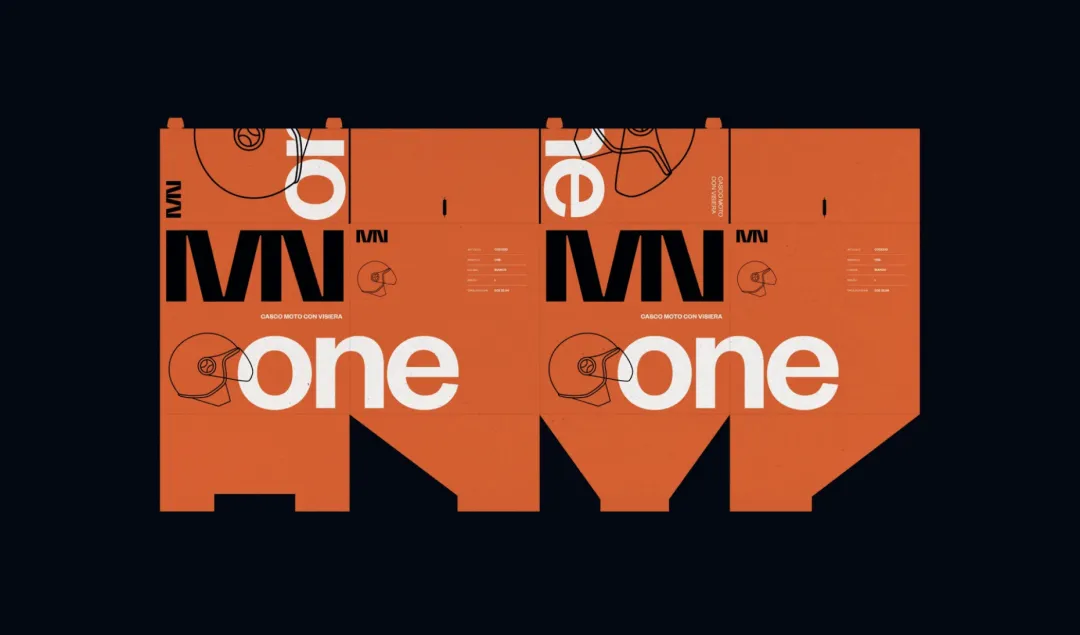
5. PACKAGING DESIGN
The packaging system was designed to give each helmet model a strong, unmistakable presence through its own dedicated color.
ONE adopts the brand’s signature warm red–orange, TWO is defined by a deep technical blue, and THREE introduces an acid green that pushes the identity into a more experimental direction.
Each box features oversized typography, minimal line illustrations, and bold contrasts, allowing the product line to remain cohesive while giving every model its own distinctive visual character.


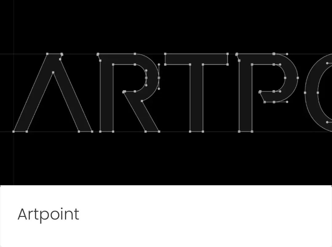
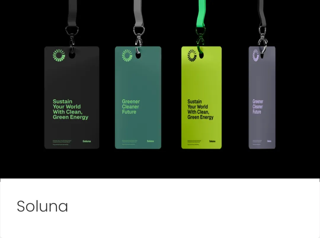
往期推荐|PREVIOUS
© HUPOOLBRAND 交流平臺
www.instagram.com/hupoolbrand
www.hupoolbrand.com
Welcome Follow US
©HUPOOLBRAND. All rights reserved.

企业品牌策略与設計解決方案.
Corporate Brand strategy and design solution.